
fixed与input处理
Mar 27, 2016
在移动端下, fixed有兼容问题,解决如iScroll, input也有兼容问题,挡住了内容无法下滑显示等等,这个就要用js控制或者从css布局处解决了。
那么,两者结合到一起会有怎样的bug?
需求
- 对于没有尺码属性选择的商品, 点击 加入购物车直接执行
- 有尺码属性选择, 则需要在右侧弹出侧边框确认
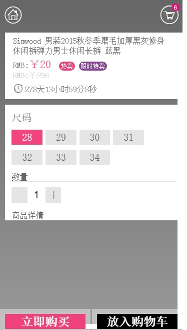

fixed
加入购物车 fixed
商品内容部分用了固定高度+ overflow: scroll;来布局,已经规避了一些兼容问题了。
底部布局:
#main .global-add-cart, .global-quick_buy {
    position: fixed;
    color: #fff;
    width: 49.5%;
    font-weight: bold;
    z-index: 99;
    text-align: center;
    font-size: 24px;
    line-height: 30px;
    bottom: 0;
    right: 0;
    -webkit-transform-style: preserve-3d;
}
当点击input时, 由于内容部分可以scroll滑动, 可以方便的输入信息, 不存在问题。
确认按钮 fixed
右侧的弹出层fixed定位, 且存在 input。
#main .golbal-size-confirm {
position: fixed;
left: 0;
top: 0;
width: 100%;
height: 100%;
overflow-y: scroll;
z-index: 222;
-webkit-transform: translateX(100%);
}
已经存在两个fixed, 两个scroll, 当iOS下点击右侧的input, 会出现挡住底部确认按钮的情况, 而滑动操作只有全局的内容滑动。
问题定位
Android 下 点击input时 右侧的弹出层能够滑动,而iOS下不行,导致挡住了确认按钮, 说明scroll没有产生效果,结合js,发现是window height的差异性导致。
- Android下input弹出输入法,window height要减去输入法所占位置,出发resize事件
- iOS下input不触发resize, window height 不变, 但输入法挡住了一片区域
解决方法
由于弹出层的内容部分高度为window height 100%, 处于一个固定值, 那么需要在input时能够scroll,只有将外层的高度改变,使其小于100%, 在这里将高度设置为80%。
$([goodsinfo[0], attrContent[0]]).on({
'click': function(e){
    var classname = e.target.className;
    /num-ins/.test(classname) && insAmount(e)  ||  /num-des/.test(classname) && desAmount(e);
},
'change': function(e){
    inputAmount(e);
},
'input' : function(e){
    var h = e.target.innerHeight >= windowHeight ? windowHeight*0.8 : e.target.innerHeight;   //根据高度变化,判断是Android还是iOS,iOS下需要调整
    $('.golbal-size-confirm').css({height:h+'px'});
},
'blur' : function(e){
    $('.golbal-size-confirm').css({height:'100%'});
}
})